Mack & the Art of the Photobook : Parr et al and its Future.

MA in Photography, Falmouth University, Module 4, Sustainable Prospects.  Research.
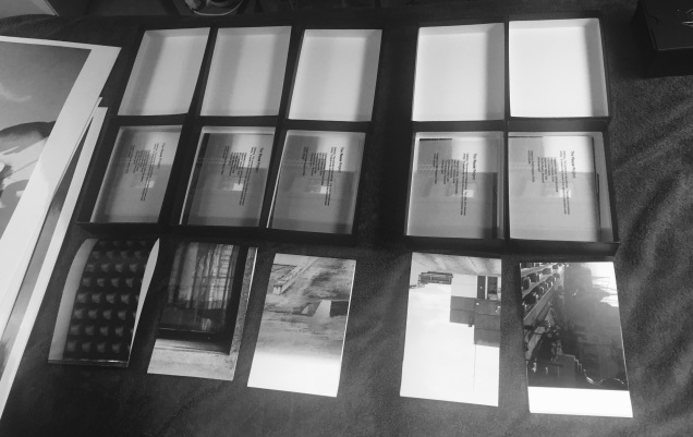
Screen Shot 2017-12-11 at 19.56.17.png

figure 1

Michael Mack, interviewed by Alexander Strecker in a recent post in Lensculture, sets out a really personal account of how he ‘ticks’ and what makes the quality of his production such a desirable and tangible thing.  Strecker sums him up thus  “there are three core beliefs that underpin everything Mack has done: first, mentors are essential; second, human relationships are paramount; and finally, that personal enjoyment is the key to long-term success”.

I make no apology in extracting substantial tracts of the interview as they serve a strong purpose, especially as it sets the agenda for my ambition to make a photobook at a future point.

On his motivations Mack says “I’m driven by a very simplistic, life-affirming notion: I want to keep enjoying what I’m doing. I don’t want to only be running a business, because much of that is quite tedious. You could be selling widgets, if all you’re focusing on is the Excel spreadsheets. In the end, the reason we are doing well is because of our attention to detail and the specificity of each design. I don’t want to do more books. I’d prefer to produce fewer titles that are higher in quality.

On the place for the tangible as opposed to the digital “there was a supposed revolution about to happen in relation to the book and ink and paper. This simply did not occur. In fact, just the opposite: the ever-expanding digital realm created the capacity for small, light-footed entities, both publishing houses and individual artists, to create their own content and market it through digital platforms. That continues to define the moment we’re in right now. It has resulted in many, many people returning to analog, physical forms for various art objects”.

A glimpse about his collaborative approach for which he is renown “Whether someone is working on the street or in their studio, we have to be sure that a book is the best possible presentation for their work. It’s never simply a catalog, a gallery takeaway, we have a studio space where the artists come and work. We bring in our designers and we sit, edit, and talk. We’ll do three days of intense work together, and then they’ll go away for a month. Then we come back together, allowing things to distill further. We give things time”.
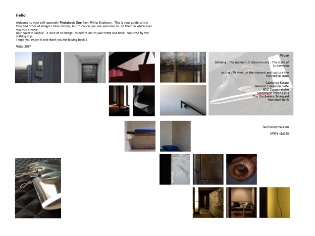
Screen Shot 2017-12-14 at 08.35.49

Figure 2

A Magnum website discussion between Olivia Arthur, Martin Parr and Fred Ritchen they review the 20 year march of the photobook; here Arthur opines “People still have a huge desire for the book, for the printed object that they can hold.” which is good to read as the future looks positive for the medium. Parr lays down the challenge for both image making and the need for purpose in a publication Photography is the easiest thing in the world but also the most difficult. It’s very easy to take a body of work and in an afternoon turn it into a book that looks contemporary and exciting but it has no soul, no message, no real substance. People believe they have made an important contribution to photography but they haven’t” 

The audience ‘span’ is addressed by Ritchin “Photobooks are having a golden era but the concern is that we are making them for each other,” and he goes on “It’s not sufficient to just talk to each other at this point. I’m looking for something that restates where we are in different ways.” and Arthur expresses her aspiration “I think we see this big cloud which is the photobook audience and what’s interesting is trying to go out and think about things differently and saying I’m going to reach these people because this is what I want to do,” and she volunteers this “We aspire to be like each other, too much so.”

Practice Planning

I aspire to create a photobook on the Pause Project.  I therefore peruse photobooks and seek out, not only the product, but the process to establish the timescale, costs, qualities and, overall, the purpose and visual/textual messaging that would create value in the widest sense of that term.  Both of these articles provide a good context to the qualitative positioning of a book.

I have started discussions with the Birmingham Chamber of Commerce about presenting the Pause Project, with a view to widening shooting opportunities but also the potential for sponsorship of a book project.  To maximise this I will be researching the sponsorship model, knowing full well that it will be often seen by sponsors as a return on investment and as such may be viewed as a form of crowd-funding modelling that will require the offer of a tangible benefit/asset upon completion.  Watch this space in 2018.

References

All quotes on Mack and image, figure 1,  taken from (accessed 11.12.2017);

https://www.lensculture.com/articles/mack-books-the-enduring-power-of-the-printed-page-thoughts-from-michael-mack

All quotes on Mack and image, figure 2,  taken from (accessed 11.12.2017);

https://www.magnumphotos.com/theory-and-practice/future-of-the-photobook/


How Many Books is Too Many Books?

MA in Photography, Falmouth University, Module 4, Sustainable Prospects

I experienced two very different photobook browsing moments at Unseen Amsterdam on 30th September.

The first was at a booth within the main space at a gallery in the main space- Matèria Rome  where I was engaged by the gallery owner who explained the work of Stefano Canto, who works with concrete and allied processes and imagery.  I purchased the book Concrete Archive (figure 1) as this will be useful as I expand my thinking about practice ( and reminding myself that I had made a request for concrete to be extracted from an imminently  demolished building in Birmingham).

figures 1, 2

The second experience was a walk around the book tent at Unseen.  The space was very busy and even though one of my favourite book sellers seemed not to be in attendance (Mack Books) there was a huge diversity of sellers and organisations in the tent.  The sheer scale of this event (acknowledging that it is far from being the largest) was overwhelming, despite my determination to purchase something as a momento of Unseen 2017.  Titles that seemed to belie the content, cover images that often tantalised with content to match and sometimes not.  Elbows and wallets to do battle with.  One full perambulation took me back to a stall where I bought a book about Stephen Keppel, called Flat Finish (figure2), which matched my wish to fish out a book that reflected my developing practice.

References

Canto, S. (2016) Concrete Archive (Rome; Drago)

Keppel, S. (2017) Flat Finish (New York; Fw:Books)

Thinking and Planning Ahead

MA in Photography, Falmouth University, Module 3, Surfaces and Strategies

Screen Shot 2017-08-17 at 12.31.08Figure 1

Reflection and Anticipation

As this module, with its absorbed learning and practice draws to a conclusion, I am considering these six things as look to new horizons.

Methodology and Strategy

I was able to share my work in progress with a photographer and he made these comments;

“Moving forwards l feel something else needs to be brought into the project. I know you “Don’t do people!” but l feel a human presence may need to be introduced. I felt that in the last module where you introduced the Priest and the guide to The Freemasons Hall, it really worked… people who had a real connection to the building. 

Also, a little context may help in that you could introduce an image of the outside of the buildings to each subject matter.. as you have done with the “Icknield Port Loop” series… but with something from a little distance? Something that may help in this regard is Donovan Wylie’s work on “British Watchtowers” in Northern Ireland…. not sure whether you are familiar with his work but well worth seeking out”.

This was useful and progressive advice.  My strategy of applying the opportunities that are emerging as part of my residency in an architect’s practice will reveal people in the studio as well as on site, thus ‘personifying’ a number of the images.  The ‘Pause’ methodology prevails. Figure 2 shows work that includes a Mason, from my previous shoot.

DSC_5427 copy

Figure 2

I have started to look at references to Wylie’s work, see figure 1 taken from the Guardian (accessed 17/8/17).  He shows strong consistency in terms of viewpoints, colour and exposure and expresses the context for the watchtowers globally.

Figures 3 + 4

I also met with the photographer Stephen Morgan who has exhibited at the Wapping Project and he explained in detail his strength for shooting and presenting his work and his very thorough method of editing (figures 3, 4).  Of my portfolio he said “Really loved the work, it had a real print quality to it, and I think you are right not to do wider shots of the outside. You get the feeling you are viewing something that has not been seen in a long time and is about to disappear, very intimate” So I am deciding how to arbitrate ‘outside views’ without diluting the intimacy of my work.  Morgan’s website

Making a Return

I am considering approaching the developers of Icknield Port Loop and seeking a commission.  I am pondering how to do this with the intention that I make imagery that is worthwhile for them to use in their development work.

Printing and colour

I am researching an uplift in self-printing technique to create archival prints of my work under my own control which is likely to necessitate investment in screen and printer.

Workshops and public engagement

I have written a blog here about the Developed in Birmingham Collective and there is a plan to deliver another photo walk around Birmingham city centre, expanding on the successful delivery of the workshop as part of this programme.

Figures  5, 6, 7, 8

Exhibition : Phase Two

I have surveyed the walls and hanging system at Bar Opus (figures 5, 6, 7, 8) and we have a PR meeting imminently to plan the launch event on 19th September 2017.  I anticipate delivering 18 new prints, framed, plus a large A1+ printed sheet of one image to act as a divider between the existing set and new sets of frames.

Photobook

Taking a long view of future book making,  I am reading through these 4 photobooks (figure 9) for lessons on binding, narrative, editing, margins, fonts, length and paper quality.

DSCF1586DSCF1591DSCF1590DSCF1589DSCF1588

Figure 9, 10, 11, 12, 13

I choose these for their diversity of scale, quality and subject matter.

On The Night Bus (figure 12) is published by Hoxton Mini Press 2016 features  the work of Nick Turpin.  It is a singular theme – views from outside buses through the, often steamed up, moisture running, windows to people in various states of melancholic and dreamy states.  It feels like a quality object to handle.  There are margins to each image and there is a mix of an image per page with many double spreads, working across the binding. A foreword by Will Self helps seal the profile of the book. It is created in a ‘portrait’ format.

Topologies (figure 11) is published by Aperture 2008. It covers a breadth of work by Edgar Martins.  The paper used has quite a slippery sheen and images (there are 111) are placed consistency on each page with an identical margin throughout.  It is a ‘landscape’ format.  There is an interview with Martins by David Campany at the rear of the book.

Ming Jue. Photographs of Longbridge and Nanjing by Stuart Whipps (figure 10) is published by New Art Gallery, Walsall 2008.  It accompanied the exhibition of the work 4th April to 1st June 2008.  It documents the fall of MGRover (2005) and the subsequent transfer of production to Nanjing Automotive, China.  The photobook is square format throughout and each image is also square, making for consistent margins. Two essays conclude the book.  The paper has a matt feel which is very pleasant to touch and turn. The cover too has a grain about it.

Zones of Exclusion Pripyat and Chernobyl (figure 13) is published by Steidl 2003. It contains the work of Robert Polidori and records access to the aftermath of the nuclear fallout.  Its ‘landscape’ format is strident in scale, creating space on successive pages of consistently scaled images of schools, homes and other buildings all vacated for a long period (since the disaster struck in April 1986). There is an exception to the editing rule where 14 pages are devoted to a series of detached homes amongst the chaotic landscape. There are over 100 pages containing images.  The paper is glossy.  The lack of narrative leaves a space for one to translate what is seen, with the exception of a list of captions (a notable point of debate; captions per page or not?).


ends


Photobook One – A ‘Surface’

MA in Photography, Falmouth University, Module 3, Surfaces and Strategies


FullSizeRender 28

Figure 1

Strategy: I made a decision to be expedient about how to create my photobook based on time, learning to date about zines, books and self publishing.  What I have called Photobook One is actually a self-assembly book.  Six have been made so far; one as the prototype and record of content and the other 5 are boxed and ready for sale at Opus Restaurant, Birmingham, along with my prints, see figure 1.

Each box contains 15 postcards, printed borderless, showing 6 projects within my overall Pause Project. The project introduction sheet was printed onto sheets of tracing paper and guillotined to exactly match the size of the postcard print sheets – this medium was chosen to create a translucent page distinct from the cover and postcards.  The font was Trebuchet MS. I have sliced up several A3 prints to create the ‘covers’ which were folded and glued in a book-making jig. Then a carefully and exactly folded (to A6) A4 guidance sheet is presented as a suggested editing series for the book (allowing people of course to use the postcards discrete too if they choose (figure 3)).  Finally a 19mm bulldog clip to hold it together after assembly, figure 2.

Figure 2

Screen Shot 2017-08-17 at 11.59.52

Figure 3

Learning

I will be intrigued to see if any of these sell (priced at £10 per box) – if not it will be a signal of the wrong approach.

I have not found a way of printing my details and copyright on the rear of the postcard paper which is a disadvantage considering the loose leaf nature of the boxed prints.

I would wish to develop skills in Adobe Indesign for future script layouts.

Prototype : Photobook One

MA in Photography, Falmouth University, Module 3, Surfaces and Strategies, Week 7

I have been reading about the design, making, graphics, market for photobooks and looking at many online – both actual books and retailers and exhibitors.  They are complex constructs.  I have been grappling my own images, with formats, tonal variations, awaiting the delivery of my book binding kit, avoiding digital format tools and concluded that I needed to create a ‘fixed point’ around which I could navigate thoughts.  I thus decided to trim all ‘white’ excess from my loose prints, then place in an order that flowed and was in my view well considered.  This meant that all the landscape format images were, for the moment, put to one side, despite some being my favourite images.  

Prototype 1

Screen Shot 2017-07-15 at 16.15.12

figure 1

This move allowed me to then experiment with a ‘cover’ that is a slice of a large A3 print of a concrete facade and fold that into a front and back cover combined. The first and last leaves are test printed onto tracing paper.  These translucent sheets took ink relatively well (I need to overcome some fine dragging problems); in prototype 2 I would alter the justification of the text to the right and alter to a degree, so an obvious learning point there.  The use of a bulldog clip to act as my binding mechanism has allowed the mock up to take a book form.  The video, complete with Radiohead and a siren in the background was made holding my iPhone in my right hand and turning the small pages (circa A6) to show progress to date. I then spent two hours attempting to upload the video, then applying mp4 conversion software and repeating the upload, all to no avail. I have as a third option uploaded to Facebook (not my preferred choice as it is a public posting).  So the use of dummy here certainly applies, but work in progress https://www.facebook.com/facilitateurban/ (note look for the post entitle ‘test dummy of photobook’ as there will be subsequent posts on that site) – see figure 1 for still from video.

A Review work in progress

The prototype was presented to peers and my tutor Stella Baraklianou on 13th July 2017.  W discussed the dilemma of orientation and the exclusion of portrait images, once suggested method was to print the portrait images to the right of the page and leave a white space to the left hand side.  There was much discussion about two sided printing.  The text on tracing paper was thought interesting because it was a foil to the standard inkjet print.  We discussed fine paper solutions to printing and the potential for binding multiple paper types into one set. I tabled the idea of a ‘set of postcards’ that people could combine into their own self-made books using the bulldog clip to hold together, with a guidance sequencing sheet and a box to contain it.  Prototype two will learn from and mature these ideas.  I also need to devise a method of trimming each sheet to exactly the same dimensions as I currently have a number of variations.

Audience

I am focusing this on a long term view that the work will be most appropriate in book form and I suspect it will take several volumes as time passes (through and beyond the MA). For this module it will be on display for viewing at a relatively high end restaurant then in the sister bar from September onwards alongside the hung work.  So, the audience here will be the business, financial, development and political communities of Birmingham, as both the bar and restaurant are anchors within the CBD and those groups are the clientele.  These are the decision makers and of course potentially commissioners.

Design

I have acquired Adobe InDesign as I have a drive to create stronger graphic work, focused especially on the use of text.  This will help create a consistency of message and appearance.

Core Methodology

I am continuing to use the statement about my practice;

Pause.  Defining : The moment of discontinuity : The state of in-between.  Acting : To dwell in the moment and capture the interstitial state.

I am negotiating working with a design business and thus the quality of work and its presentation will gain increasing importance and relevance.